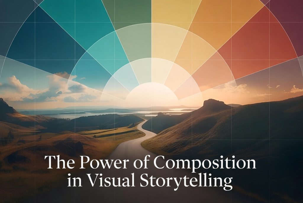
Adopting the principles of composition and learning to use them effectively, individually or in combination, gives you an advantage in telling a story through your work. Design and composition add a level of richness to your visual content, helping to grab attention or gain the click.
Part of design entails communicating an idea, a perspective, or a point of view. But conveying the magic you envision or expressing your creativity in a way that others understand, or even feel, is much more difficult.
That’s why studying the elements of art and composition and understanding how quickly the brain works– even at a subconscious level– is critical in creating and telling a meaningful story through your photography, graphics, video, or any images.
My initial interest and investigation into design and composition began with presentations in mind. But visuals and graphics are essential to digital creators in countless other ways.
Using these principles helps you communicate visually with power, impact, and intent. Perhaps more importantly, you can inspire, delight, educate, enlighten, surprise, or intrigue viewers.
Learn the rules like a pro, so you can break them like an artist.
~Picasso
First Concepts for Powerful Composition
Layout
The overall condition or foundation of a design is the layout, the overall space containing all the content and components. Often, a layout is universal across pages, campaigns, series, or collections, etc.
Grid systems allow for consistent placement and spacing within a format and help to scale or layer. Repetitive styles, patterns, and other visual cues are established there (in grids) for balance, flow, and consistency. Eye appeal is key. In some cases, branding may play a role.
Hierarchy
Hierarchy is also integral to layouts, emphasizing specific aspects within a design. You can highlight different elements in different ways. For example, using font size or text weight, bright or high-contrast colors, object sizing or scaling, proximity, etc.
Positioning, balance, and depth are all important for hierarchical display.
White Space
White space also has to do with positioning or placement, and is also called negative space. A cleaner or more crowded use of space communicates emotionally, often with power, sometimes overwhelming, or perhaps simplicity-inducing, and more.
Proper use of white space always lends to the story.
Why our eyes look for patterns in architecture…
Alignment
Aligning elements in an area adds to your story and shows hierarchy within the frame. Alignment can be expected or utterly unexpected by design and can generate engagement or guide the eye in a specific direction. Alignment can create patterns in an image.
Contrast
Ansel Adams’ renowned practice in black and white photography demonstrates he’s the king of contrast, using high-level greyscale in his unforgettable photographic captures.
Unlike white space, which represents negative space (or exact opposites like black/white), contrast in photography also represents grayscale, adding depth and layers to a look.
Details are best depicted through good contrast or by showing bold opposites for stark attention.

Color, texture, contrast, and hierarchical alignment create striking depth in this image.
Texture
A mention of texture has a place somewhere around here, and creating texture mixes a few things, including contrast and hierarchy, alignment and size, perspective, and leading lines. Shadows and light/dark add texture. So does focus or bokeh.
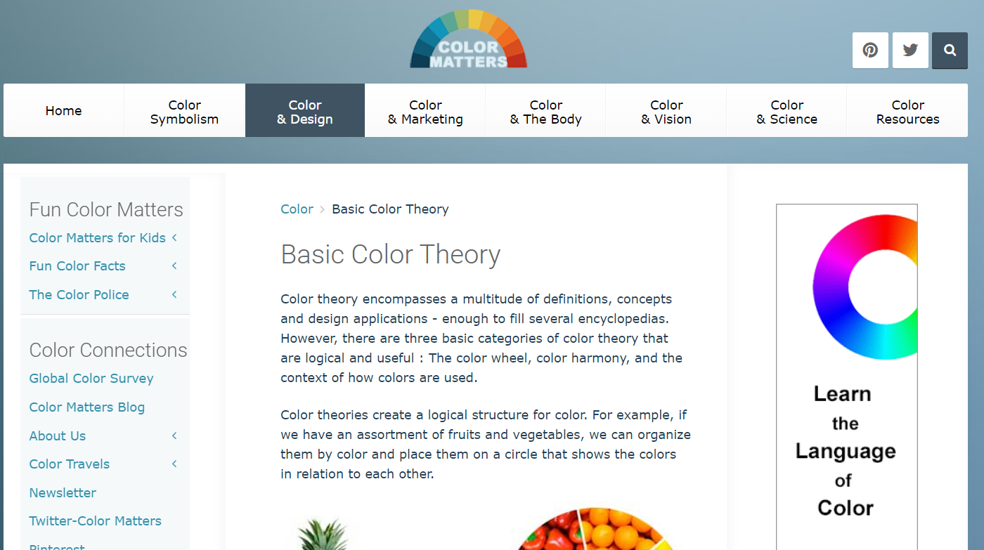
Color
Besides grayscale, the range of gray shades between black and white, color also reveals contrast to spotlight particular elements within a design layout. Besides using contrasting colors to attract attention, color combinations and other color design variations offer a powerful visual intensity, add mood, and insinuate feelings.
Check Adobe’s Basic Color Theory Page, and play around with color palettes; review the Color & Marketing section or Color Symbolism. And have fun!
Sometimes color combinations surprise you, and yes, color can create hierarchy. Experiment with color, and try lighting to manipulate it. And again, have fun with color. Colors make bold statements and may even “carry” an image. Color’s all that!!
The use of colors, contrast, hierarchy, and white space aids in creating shading, shadows, intensity, and detail to inspire your story.
One thing to keep in mind for colors and fonts is user experience or accessibility, especially for web-focused applications. Not keeping the user, viewer, or audience experience in mind constrains your work from getting seen, understood, and appreciated. (And why using brain-friendly composition and design tactics is valuable.)
Here’s a Color Wheel to give you color palettes based on your preferences. Take it for a spin or five:)
Why Color Matters
More than one painting, photo, event, film, drawing, or other artistic experience is color-inspired. What color inspires you? Have you taken it for a creative spin yet?
Substantial research shows why color matters and how color plays a pivotal role in all our visual experiences. ~Jill Morton, Colorcom
In the article Why Color Matters, Jill Morton explains that research reveals “people make a subconscious judgment about a person, environment, or product within 90 seconds of initial viewing and that between 62% and 90% of that assessment is based on color alone,” among other research-driven information.
 Color contrast or limited use of colors makes a bold statement.
The psychology and symbolism of color are often essential considerations for branding, corporate design, and packaging. Attracting customers through color is BIG business, and another indication of the subconscious emphasis color delivers.
Awareness of color and color design brings a lot of inspiration to your campaign designs or brand identity, and also recognition if used effectively.
Understanding color as a symbol helps communicate meaning nonverbally and often represents a universally understood meaning.
Rule of Odds
According to Wikipedia:
“The ‘rule of odds’ suggests that an odd number of subjects in an image is more interesting than an even number. Thus, if you have more than one subject in your picture, the suggestion is to choose an arrangement with at least three subjects. An even number of subjects produces symmetries in the image, which can appear less natural for a naturalistic, informal composition.”
Interestingly, the term is listed under the topic “visual arts.” This is a good reminder that the combination of art and story is easily relayed when you learn the language of the brain because it swiftly interprets what it sees at lightning speed.
Avoid symmetry when applying the rule of odds in your work to make the brain stop and take notice by changing up the expected pattern.
The Appeal of Repetition
Repetition is mesmerizing but can also establish a pattern, allowing you to showcase something different, as it sticks out in your hypnotic pattern with a swoosh.
Highlighting the hero in a definitive pattern gains quick attention and pulls the viewer’s eye to your desired subject lickety-split.
A repetitive pattern creates unique designs and perspectives on its own as well.
Leading Lines
Leading lines often create repetition in an image, plus draw a viewer’s attention to a particular spot.
But leading lines don’t have to be lines at all. Landscape and scenic photographers create leading lines with trees, mountainscapes, stones, fences, and other natural features. A winding creek is a good example, or railroad tracks.

An instance capturing leading lines, the rule of thirds, and repetition in one shot?
Rule of Thirds
One way to divide your frame into grids is to use the rule of thirds. Thirds also honor the rule of odds by breaking the expectation of even numbers or centered main subjects.
There are several ways to use the Rule of Thirds to direct attention to a desired area of your photo or design layout. Experiment with this one, and remember the center section isn’t the only third to focus on for images or designs. Use it, like other techniques, to draw the eye to where you want viewers to look.
Place a viewer’s attention where you want by using this grid of thirds! Offer an unexpected or unique point of view using this rule!
Visualizing your photograph’s story in thirds helps you learn to “fill the frame” and draws the eye of the viewer to the focal point. Establishing a feeling of movement or direction adds an active quality to your shot—another thing you can achieve by mastering this design rule.
“The main reason for observing the rule of thirds is to discourage placement of the subject at the center or prevent a horizon from appearing to divide the picture in half.” ~Wikipedia
Cognitive Capabilities Increase Design Sense
All techniques and representations showcased so far are ways to help you communicate nonverbally yet meaningfully. Test each individually. Then try working with combinations.
But remember, striving to create a universal meaning for others through your photography and graphics requires an understanding of which elements of design and composition to use or NOT use.
Selecting the perfect mix of ingredients and then blending them to craft a tale is the talent and goal. But learning and recognizing these design elements is the first step.
Only when you observe and continue to understand these techniques will you be able to properly use components to conjure what you imagine in a way that brings that meaning to others. More than “capturing” something in the frame of your image, you are actively “creating” it instead.

The color design in this image is uber appealing. Notice other captivating composition techniques?
Crucial Observations
Observing lighting, the setting/physical environment, subject matter, purpose, and other factors in advance of shooting to allow you time to envision and pre-plan. You’ll love how your photography becomes intentional and not accidental.
Learn to control your work as you familiarize yourself with these design perspectives and others. Practice them, observe, and study. You may find yourself evolving with these techniques.
Enhance your photography and designs with your take, a personal spin, or a unique viewpoint only you can deliver. For example, some photographers progress to a “signature look” or styling, making their work recognizable and known.
No matter your goal, learning the language of art and design lets you speak to the human brain without words, and much more clearly. Of course, your preferred genre is a factor in how to express your visual messaging. Yet still, flexibility and exclusivity in what you produce always start with a thoughtful understanding of the basics.
When you play into the subconscious constructs for how a human brain functions, you can use visual language to convey the story your photograph, image, or design is trying to tell.
Creativity by Design for Visual Storytelling
Many artists and creators base their aesthetics on gut instinct and feelings. Still, practice, natural and acquired skills, industry knowledge/education, and even experimentation are factors.
When you want to develop and improve, bringing ideas from your mind’s eye to life through your photography and designs, these elements of art are helpful. So, understanding these concepts (and using all tools at your disposal) allows you to express and convey an image’s story compellingly.
Further, using the visual language of art to make subconscious connections with the human brain smooths the way for your main point (subject, hero) to be seen and understood.
Strong images are compelling because they tug at the viewer, drawing them in and invoking feelings, memories, surprise, or thoughts. But every element in the frame needs to be part of the story you are trying to communicate or, conversely, take away from it.
The language of visual art speaks silently but boldly. It compels a viewer to see or understand something you want to convey. Maybe it invites conversation and interpretation, or perhaps invokes an emotional response different for everyone.
What I think is that this stuff is powerful. How about you?


I see the science in story telling here, Sue-Ann.
The unconscious dominates the world even though we appear to be acting consciously. Getting into the science of it all makes sense.
As for white space, I use it amply to shine the spotlight on my content, from travel images to words. The contrast is critical to avoid confusing readers.
Fabulous post.
Ryan:
I love the concept of learning to speak the language of art, but truly, design plays a big part. So I had to investigate further.
There are so many interesting pieces to unlock the puzzle for clearly communicating ideas or even feelings to others. We don’t always realize or maybe acknowledge the subconscious role in conveying memorable stories and information.
Thank you for understanding the importance and for taking the time to comment! Best— Sue-Ann