
Does Your Website Invite?
Arguably, your website is your most important digital asset. For that reason, it’s imperative you give it some love. 💕
And by love, I mean taking time for thinking, focus, evaluation, and yep, upgrades!
Remember your website is always a work in progress. You want to create a living and breathing communications hub.
It needs to be inviting.
See, as it turns out, your website isn’t about you. Unfortunately, many businesses just don’t think of it this way. But, you should.
User? Experience?
Designing your website is about creating a user experience.
But, if you’re anything like me, users or visitors are the last things you’re mulling over as you dream up your website plan.
And hey, this mistake is an easy one to make. Especially for us live-and-breath-business types.
See first, we know what we’re talking about in business, especially in our own industry.
And, we love corporate buzzwords and biz-speak—what my friend Henneke calls gobbledygook. (But don’t worry, she’s on a crusade to rid the world of it!)
It’s even worse if you’ve been down the MBA trail and learned TQM (or total quality management) and other such management systems.
Heck, every company out there was pushing the same pail of words, no matter the business. “Total quality,” “excellence, “innovation,” “continuous improvement,” and “commitment to service” were the key phrases hung on every business of every kind.
But, let’s face it, what do those words really tell us about you, your business, or what you do?
Why do they make me care?
Especially when they are a dime a dozen, both overused and useless in helping me get to know you or, understand anything real about you.
They’re corporate-eez alright but, they’re also less than vague. They don’t even speak to an industry audience-in-the-know to find relevance.
The lesson? Pick your words well. Try to embrace specific, simple, and clear in what your website communicates.
Place yourself on the other side of your business, looking in. Instead of only seeing things from where you sit, on the inside, looking out.
Your Website is Part of Your Integrated Marketing Plan
While your website is part of your integrated marketing plan, it also holds the key to interaction and engagement.
So, remembering a user-first attitude, these goals are the main point in how your website communicates, increasing your odds at website success.
Because marketing your business is now a two-way discussion, your focus shifts, realizing an audience decides your fate. Their interactions, reactions, and engagement are insights to understanding your business, helping you to gain the outside perspective you so vitally need.
If you design your site with the idea of creating an illuminating visitor experience and dump the all-about-me attitude, you’ll do better in speaking to the people you’re trying to connect with.

How to Hone In on Your Homepage
I’ve been paying attention to Donald Miller and the StoryBrand message for some time now.
So, as you can imagine, I was pretty darn excited when I was able to grab his new book.
(Note: I’m sure I’ll be sharing more good stuff from it with you guys as soon as I dig a little deeper.)
But, the thing is, since I began paying more attention to Don’s message, I sure am noticing a whole lot of cases where people are doing it wrong!
I keep finding examples of sites (without even trying, mind you) that are more like an attack on your senses than an inviting place to land.
Are you inviting visitors in? Hmm.
The words, and often an abundance of them, are meaningless and leave visitors feeling confused.
Remember the mighty power of words, and make each you include intentional and sticky, so your meaning resonates in minds and hearts of readers.
I hate facing this part and you may too. Are you ready for the news?
Because the bottom line truth about your site is how it looks isn’t nearly as important as how easy it is for people to navigate.
Your Homepage Has Only 3 Jobs
In a simple and straightforward way, Donald says your homepage needs to do 3 things and 3 things only!
First, when visitors arrive at your site, they need to know who you are.
Secondly, they want to know why should they care…in other words, remember WIIFM. (What’s in it For Me?)
Be sure that how “who you are” (your brand, product, or service) and “why they should care” are clearly stated and related.
Finally, the third thing to do on your homepage, with clarity and definitely, is to tell visitors what you want them to do next.
Don’t Forget CTA, CTA!
Give them a CTA, a call-to-action, letting them know exactly what to do.
You must tell them what to do so they don’t have to guess. And, more importantly, you want to lead them down a path in a particular way.
You know, the way you want.
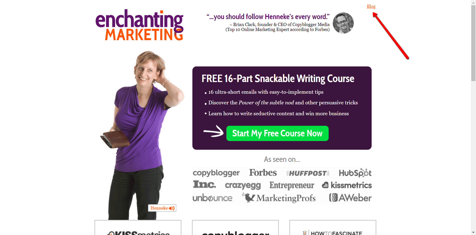
Now, you can offer people more than one pick. You can segment them by their specific needs.
On Henneke’s Enchanting Marketing (see below) site, she features her free email course (which I suggest you sign up for!) for a place to start. Or you can go straight to the blog using the single button in the top corner.
For example, a beginner level and an advanced level entry to your site.
Or maybe, you want to give an option to signup for a free product trial for visitors who are ready to hop right in.
But, for others, who are not warmed up enough or ready for whatever reason to jump in, you can have a second option.
For example, You may want to send them straight to your blog, perhaps, so they can begin to learn more.
The main thing you want to do is give people a reason to stay. So, make sure you give enough detailed information so your target market knows you are speaking to them, specifically.
Also, try to spark enough interest or excitement or curiosity or just plain be persuasive enough to entice people to take just one action.
And, to stay with you.
The homepage experience you provide is a very important first step to forming relationships and building an audience for your business.
In making solid connections, you build and grow business and a shining reputation, along the way.
What do you think about using this formula on your homepage?
A Closer Focus
First, are you clear or at least getting clear, on your brand message?
Are you making it stupid easy for your site visitors to immediately know what your business is about?
If you’re not clear on what you’re peddling and who it’s for, then how do you expect anyone to be enticed to engage with your business?
On my site, I ask in the very first homepage frame, “Need Better Content for Your Website?”
Since I’m a content creator, I’m trying to let visitors know, hey, you’re in the right place if you need quality web content.
At the same time, by posing a question, I’m trying to connect with a key digital problem many businesses face. I want to make the person reading say, “Well yes, I do!”
Additionally, when folks click on my site, they see “Content Creator for Business” as the tag message when your cursor skims the URL. On top of that, I’ve set my little site icon as a subliminal message, signaling “writer.”
It was designed by the same artist who created my perfect Logo. The Logo also does a beautiful job relaying a message about who I am.
Not only as a writer, but as a business, and a person.
Express Me But, Talk to You
I feel it looks, well, professional for one thing and therefore, makes a good impression immediately.
It also features an unusual color combination. So unusual, that when I proposed the colors to the artist, her first reaction was, “I don’t think so.”
But, she agreed to play with the colors—probably only to humor me—and in the end, completely changed her opinion and loves the blend also, just like me!
What this shows to visitors is something other than typical Logo colors.
Instead, it’s something unique and original. Definitely a reflection of me as a business and of my work.
Finally, I love how the artist understands and expresses ME so well in the design. I think I hit the jackpot, lucky me.
It’s a perfectly professional and business-like design but, with a creative flair!
It shows a trusty pen—my most rudimentary content tool—as a paintbrush. So, it reflects my essentially ALL BUSINESS ALL THE TIME mentality BUTTTT with a creative side I just can’t deny. Business and creative.
So you see, the fine details of who I am as a business are showcased by the Logo’s visual message.
Further, the visual design highlights a key point in the company name, because web content creation usually starts with strong writing but, most often requires a “mix.” A mix of talents, for one thing.
A content mix, a marketing mix, a media mix—all digital business hub assets requiring business and creative skills, starting with extraordinary writing.
Whoa—that’s a lot of mix, sizzle and shake going on using just one line of copy and a few visuals. Right?
Now, take a look at your site. Do you have these first mega significant details covered?

Identify & Clarify Your Web Content’s Direction
Before you move on to evaluate the rest of your website pages, doing a content marketing audit like Andy Crestodina details is a valuable business building exercise. Not only to help align your business and content strategy for improvement but, to infuse your strongest performing content into planning.
Businesses change, customer needs change and even the external business environment can influence operations, calling for alterations or adjustments.
“...view your marketing through a 'how can we be more human' lens.”~Mark SchaeferClick To Tweet
Luckily, your web assets and digital presence are malleable and constant evolution is a must and not a disaster! But, the more you hone in on where your business message meets your customers’ needs, the more successful you’ll be in fostering engaging interactions.
Humanizing your website extends to other content marketing components like adopting a human social media strategy for amplifying your content and reach. In this podcast interview by Douglas Burdett, Mark Schaefer talks about making all your marketing “more human.”
Looks like your website is smack dab in the center of your digital presence, acting as a conduit for both inbound and outbound marketing, ultimately.
So, seems this hub you’re creating around your website magnifies the importance of a strong central business communications core.
Focus. Clarity. Simplicity.
Keep those in mind because now, to maintain focus and brand message clarity sitewide, you’ll want to stay on course strengthening and not diluting your core direction.
Start with filtering your key categories down to seven, max. Remember those visitors to your pages who need an instant understanding of what’s going on; so, don’t offer six zillion directions to confuse and lose them. Right?
User experience means walking beside them, hand-in-hand, understanding and empathizing with their needs. Wants. Or desires.
You want your website to be so inviting, people feel your hand reaching out and inviting them along. Okay? Got it?
Let me know what you think by piping in, in the comments below:) Thanks.
Side Note: You may notice upgrades and changes going on here at this website and I hope you like them. I have to say, it’s been a ton and a half of work but, I’m excited to keep improving—and, yep, learning WordPress tricks along the way!
There’s still a bunch happening so I invite you to stop back, anytime.
This is what i am looking for, i feel inspired by you.
The next is I’m going to upgrade my website as i read in your valuable article.
I had several time to our Write mix for business website, every time i get new ideas.
Thankyou Ms. Bubacz
Rahul:
I’m so pleased you are finding the content here helpful. I wish you continued success in your blogging journey. And, I really appreciate your kind shares and comments as well. Let me know if I can help in any way. Take care, Sue-Ann
Yeah sure Ms. Bubacz…
😊
Hi Sue-Ann, I’ve got to work on my home page next. You have really inspired me. I’ve been thinking about it but I think the old blog on the home page is old school now.
Thank you!
I need to get more clarity into what I do and showcase it on the site and blog.
I really love the look of your blog, clean white space and beautiful graphics 🙂 It makes it for easy reading and you feel comfortable here.
Lisa:
Oh my gosh, thank you for stopping! And yes, I think I was still learning how to do it all for the first time and things are already changing and advancing!
Your comments about the feel here are so inspiring to hear because you are inspiring. And, I’ve been working hard to continually improve, evolve, and get better around here. Maybe it’s finally coming along based on your observations. Yay and thank you, again. Sue-Ann
Hi Sue-Ann,
This is my first visit to your blog, and I like what I’m seeing. Do keep it up.
Coming to your post, a lot of people don’t really know the importance of giving their users an awesome experience upon visiting their site. Once someone comes to your site the first time, if he’s not impressed by what you’re doing, he’ll definitely not come back again.
It is, therefore, of utmost importance to pay attention to our blogs user-experience as it’ll, to a large extent, determine how people see us and our business.
Thanks for sharing.
Couldn’t say it any better than that, Anil!
Thank you so much for the thoughtful comment and for taking time to stop in, as well:)
Here’s to delivering an experience to bring people back… Best, Sue-Ann